Designer Karl Lagerfeld once said “Logos and branding are so important. In a big part of the world, people cannot read French or English–but are great in remembering signs.” Sure, Karl Lagerfeld designs women’s handbags for a living, but the man is right. Mr. Lagerfeld is experienced and smart enough to understand the importance of a good logo in any industry. Languages may not always translate, but signs can “speak” volumes. Thus the reason why it was so important to give our logo a fresh, updated and well-designed spin.
It’s certainly been a happy eight years with our former logo, there’s no doubt about that. However, after bringing some fresh eyes, it was evident it was time to make a change. Chris Deardorff, CEO and Marketing Director of Magic Flight Studios really stressed the importance of our logo being somewhat indicative of our industry. Was our old logo conveying the right message? Unfortunately, it wasn’t. So the journey for a new logo began.
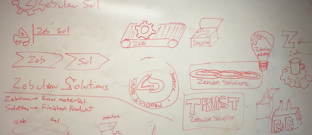
In the first of what would be many phases, we brought the whole team together to brainstorm. There were many, many long hours spent tossing around ideas and concepts. Something we are all too familiar with here in the product design world. We definitely had fun, but it wasn’t pretty. It was kind of ugly and it was definitely messy, as you can see below.

We came up with hundreds of great ideas. Unfortunately, we had to narrow it down to four promising concepts. Once those concepts were decided on, we sought out a professional graphic designer who could execute a simple, clean logo while effectively giving the audience a good idea of what it is that we do.
After some extensive research and a few referrals, we located our designer. Our designer was professional, experienced and creative. He took our needs and ideas for our new logo and created several great variations from our four concepts. He even took a shot in the dark and came up with a few logos of his own. After several iterations, we had a winner. We were certainly elated with the designs he presented, not to mention surprised. Why surprised? The logo we chose was not one of our original four concepts, it was the designers’. He was able to take a little something from each concept and create a logo that is memorable, while at the same time translates who we are and what we do.
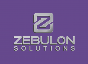
The final logo you see before you gives you a little of the old, with a lot of new. It incorporates the old, but new shade of what we call “Zebulon Purple”, while bringing in an industrial feel with the silver, metallic logo and lettering. It’s bold while still being clean and simple. It’s exactly what we’ve been looking for! Be sure to keep an eye out for our two to three other variants of our new logo in the coming weeks and months.
We are certainly thrilled with our new logo and we hope you are too. May it now be forever be burned into your brains. We’re kidding, of course, but hopefully our new logo will pop into your brain the next time someone is in need of product design or manufacturing help! Please feel free to let us know what your think of the new logo in the comments below.
Cheers!
Steph